Branding
Branding including design of logos and entire brands as well as refreshing existing brands


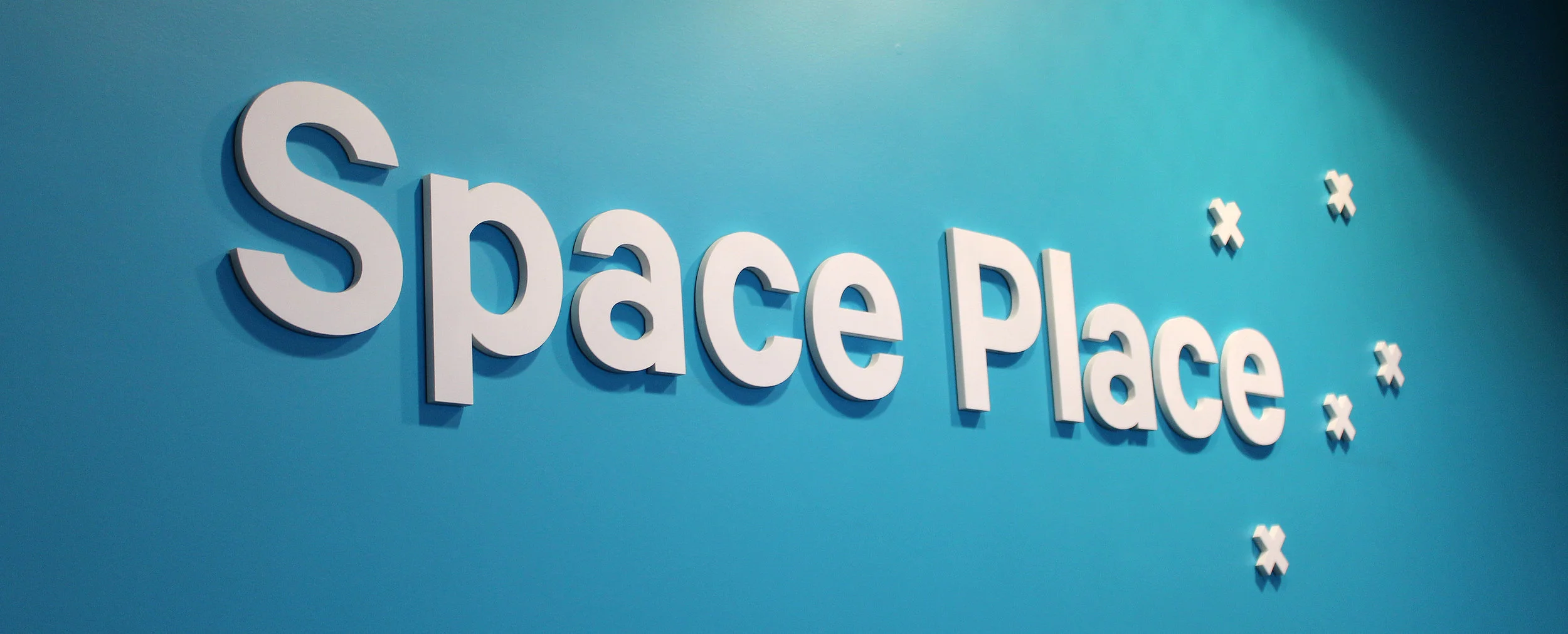
Logo and brand design for Museums Wellington and its four museums: Wellington Museum, Cable Car Museum, Nairn Street Cottage and Space Place. The brands needed to feel like one coherent family yet with distinct personalities to reflect their different offerings. I used the cross motif to represent Wellington Museum's tukutuku panel, Cable Car Museum's cable car journey, Nairn Street Cottage's framed cross stitch and Space Place's perspective of the southern sky in the Southern Cross – meaning that the crosses both unify and diversify the brands, alongside colour and typography.

Logo and brand design for Museums Wellington and its four museums: Wellington Museum, Cable Car Museum, Nairn Street Cottage and Space Place. The brands needed to feel like one coherent family yet with distinct personalities to reflect their different offerings. I used the cross motif to represent Wellington Museum's tukutuku panel, Cable Car Museum's cable car journey, Nairn Street Cottage's framed cross stitch and Space Place's perspective of the southern sky in the Southern Cross – meaning that the crosses both unify and diversify the brands, alongside colour and typography.
Pictured here: business cards

Logo and brand design for Museums Wellington and its four museums: Wellington Museum, Cable Car Museum, Nairn Street Cottage and Space Place. The brands needed to feel like one coherent family yet with distinct personalities to reflect their different offerings. I used the cross motif to represent Wellington Museum's tukutuku panel, Cable Car Museum's cable car journey, Nairn Street Cottage's framed cross stitch and Space Place's perspective of the southern sky in the Southern Cross – meaning that the crosses both unify and diversify the brands, alongside colour and typography.
Pictured here: promotional brochure for all four museums

Logo and brand design for Museums Wellington and its four museums: Wellington Museum, Cable Car Museum, Nairn Street Cottage and Space Place. The brands needed to feel like one coherent family yet with distinct personalities to reflect their different offerings. I used the cross motif to represent Wellington Museum's tukutuku panel, Cable Car Museum's cable car journey, Nairn Street Cottage's framed cross stitch and Space Place's perspective of the southern sky in the Southern Cross – meaning that the crosses both unify and diversify the brands, alongside colour and typography.
Pictured here: seasonal events guide for all four museums

Logo and brand design for Museums Wellington and its four museums: Wellington Museum, Cable Car Museum, Nairn Street Cottage and Space Place. The brands needed to feel like one coherent family yet with distinct personalities to reflect their different offerings. I used the cross motif to represent Wellington Museum's tukutuku panel, Cable Car Museum's cable car journey, Nairn Street Cottage's framed cross stitch and Space Place's perspective of the southern sky in the Southern Cross – meaning that the crosses both unify and diversify the brands, alongside colour and typography.
Pictured here: Space Place interior signage

Logo and brand design for Museums Wellington and its four museums: Wellington Museum, Cable Car Museum, Nairn Street Cottage and Space Place. The brands needed to feel like one coherent family yet with distinct personalities to reflect their different offerings. I used the cross motif to represent Wellington Museum's tukutuku panel, Cable Car Museum's cable car journey, Nairn Street Cottage's framed cross stitch and Space Place's perspective of the southern sky in the Southern Cross – meaning that the crosses both unify and diversify the brands, alongside colour and typography.
Pictured here: magazine ad for the launch of Space Place

Logo and brand design for Museums Wellington and its four museums: Wellington Museum, Cable Car Museum, Nairn Street Cottage and Space Place. The brands needed to feel like one coherent family yet with distinct personalities to reflect their different offerings. I used the cross motif to represent Wellington Museum's tukutuku panel, Cable Car Museum's cable car journey, Nairn Street Cottage's framed cross stitch and Space Place's perspective of the southern sky in the Southern Cross – meaning that the crosses both unify and diversify the brands, alongside colour and typography.
Pictured here: billboard ad for launch of Space Place

Logo and brand design for Museums Wellington and its four museums: Wellington Museum, Cable Car Museum, Nairn Street Cottage and Space Place. The brands needed to feel like one coherent family yet with distinct personalities to reflect their different offerings. I used the cross motif to represent Wellington Museum's tukutuku panel, Cable Car Museum's cable car journey, Nairn Street Cottage's framed cross stitch and Space Place's perspective of the southern sky in the Southern Cross – meaning that the crosses both unify and diversify the brands, alongside colour and typography.
Pictured here: Cable Car Museum exterior signage

Logo and brand design for Museums Wellington and its four museums: Wellington Museum, Cable Car Museum, Nairn Street Cottage and Space Place. The brands needed to feel like one coherent family yet with distinct personalities to reflect their different offerings. I used the cross motif to represent Wellington Museum's tukutuku panel, Cable Car Museum's cable car journey, Nairn Street Cottage's framed cross stitch and Space Place's perspective of the southern sky in the Southern Cross – meaning that the crosses both unify and diversify the brands, alongside colour and typography.
Pictured here: Wellington Museum street flags

Logo and brand design for Museums Wellington and its four museums: Wellington Museum, Cable Car Museum, Nairn Street Cottage and Space Place. The brands needed to feel like one coherent family yet with distinct personalities to reflect their different offerings. I used the cross motif to represent Wellington Museum's tukutuku panel, Cable Car Museum's cable car journey, Nairn Street Cottage's framed cross stitch and Space Place's perspective of the southern sky in the Southern Cross – meaning that the crosses both unify and diversify the brands, alongside colour and typography.
Pictured here: Wellington Museum exterior signage

Logo and brand design for Museums Wellington and its four museums: Wellington Museum, Cable Car Museum, Nairn Street Cottage and Space Place. The brands needed to feel like one coherent family yet with distinct personalities to reflect their different offerings. I used the cross motif to represent Wellington Museum's tukutuku panel, Cable Car Museum's cable car journey, Nairn Street Cottage's framed cross stitch and Space Place's perspective of the southern sky in the Southern Cross – meaning that the crosses both unify and diversify the brands, alongside colour and typography.
Pictured here: Wellington Museums trails (visitor guides for thematic tours of the museum)

Logo and brand design for Museums Wellington and its four museums: Wellington Museum, Cable Car Museum, Nairn Street Cottage and Space Place. The brands needed to feel like one coherent family yet with distinct personalities to reflect their different offerings. I used the cross motif to represent Wellington Museum's tukutuku panel, Cable Car Museum's cable car journey, Nairn Street Cottage's framed cross stitch and Space Place's perspective of the southern sky in the Southern Cross – meaning that the crosses both unify and diversify the brands, alongside colour and typography.
Pictured here: Wellington Museums trail interior (visitor guide for thematic tour of the museum)

The Royal Society of New Zealand wanted to refresh the branding while retaining their existing logo. A project from my time at Fortyfive Design, we introduced dynamic squares to play of the existing black square of the logo as well as a vibrant colour palette and powerful photography.
Pictured here: logotype for signage

The Royal Society of New Zealand wanted to refresh the branding while retaining their existing logo. A project from my time at Fortyfive Design, we introduced dynamic squares to play of the existing black square of the logo as well as a vibrant colour palette and powerful photography.
Pictured here: building project vision brochure

The Royal Society of New Zealand wanted to refresh the branding while retaining their existing logo. A project from my time at Fortyfive Design, we introduced dynamic squares to play of the existing black square of the logo as well as a vibrant colour palette and powerful photography.
Pictured here: introductory brochure

The Royal Society of New Zealand wanted to refresh the branding while retaining their existing logo. A project from my time at Fortyfive Design, we introduced dynamic squares to play of the existing black square of the logo as well as a vibrant colour palette and powerful photography.
Pictured here: calendar on that year's theme of light

At Fortyfive Design we put on a photography exhibition in the tradition of an exquisite corpse. I was responsible for designing a logo, a poster campaign, marketing material and signage for the exhibition – as well as contributing to the photography.
Pictured here: two posters from the campaign series

At Fortyfive Design we put on a photography exhibition in the tradition of an exquisite corpse. I was responsible for designing a logo, a poster campaign, marketing material and signage for the exhibition – as well as contributing to the photography.
Pictured here: exhibition signage

At Fortyfive Design we put on a photography exhibition in the tradition of an exquisite corpse. I was responsible for designing a logo, a poster campaign, marketing material and signage for the exhibition – as well as contributing to the photography.
Pictured here: marketing flyers

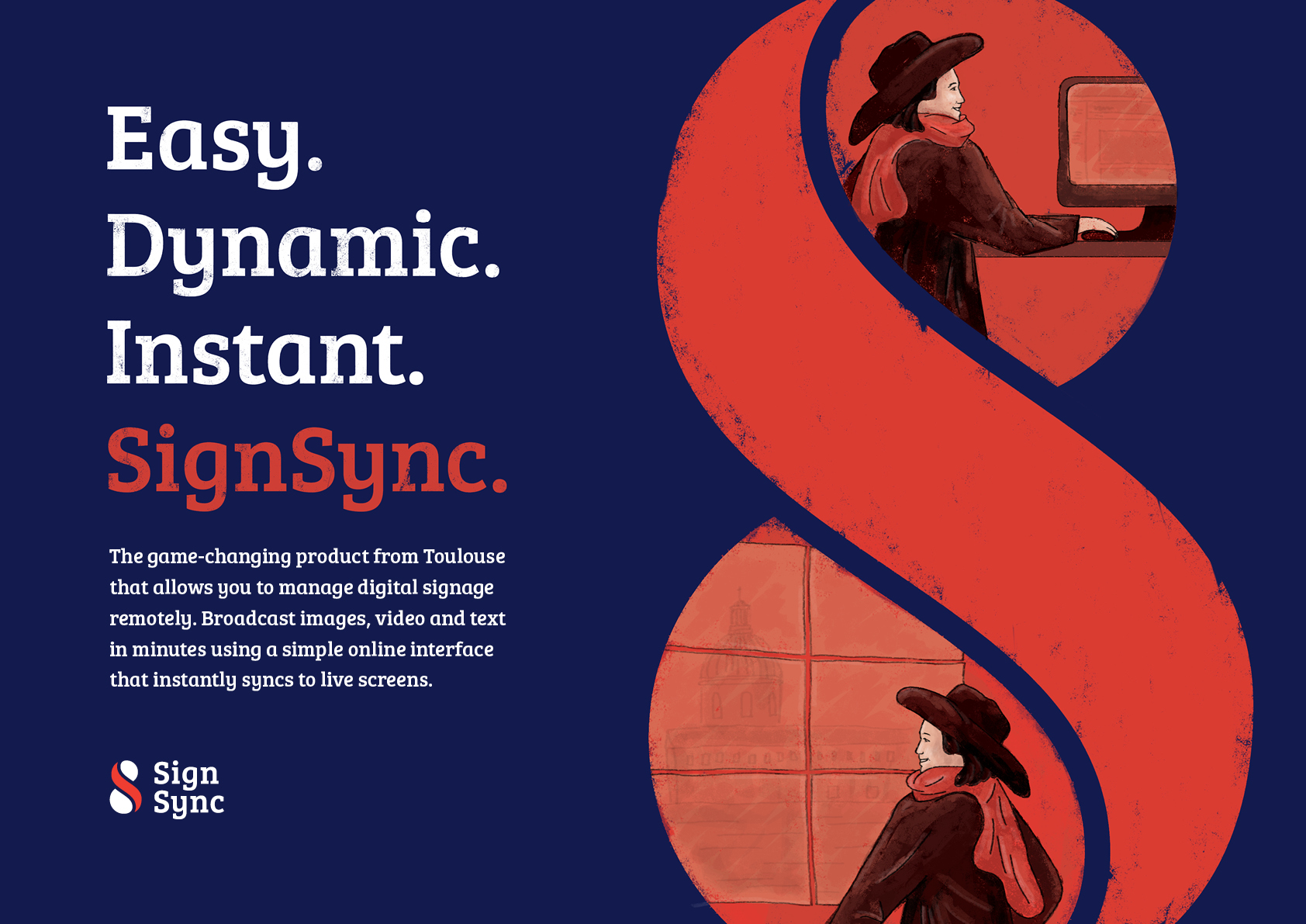
Branding and digital promotional ‘brochure’ for SignSync by Toulouse, involving custom illustration building on the Toulouse brand.

A selection from other brands I have designed.


